


If you’re building your own Stan Store this year, seeing what others are doing well can spark ideas, sharpen your branding, and help you avoid rookie mistakes. In this article, we’ll walk you through real examples from creators using Stan Store in 2026 showing how they write bios, structure their landing pages, pick products, and brand themselves. We’ll highlight what works and give you tips you can adapt for yourself.
Key Things to Look For in Stan Store Examples
Before copying ideas, check for:
- Clarity: You should know in 5–10 seconds what the creator does and who they help (target audience).
- Conversion cues: Testimonials, proof, social proof, strong calls to action.
- Visual & brand consistency: Fonts, colors, images should feel polished.
- Offer variety: Some high-ticket, some low-ticket, maybe freebies / lead magnets.
- Simplicity: Too many choices can be overwhelming. Many high-performing Stan Stores keep offers simple.


Stan Store Bio Examples
Here are real-creator bio examples, how they do them and what parts stand out.
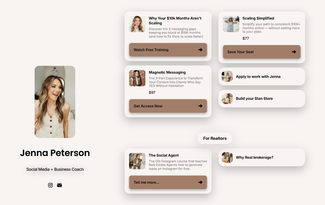
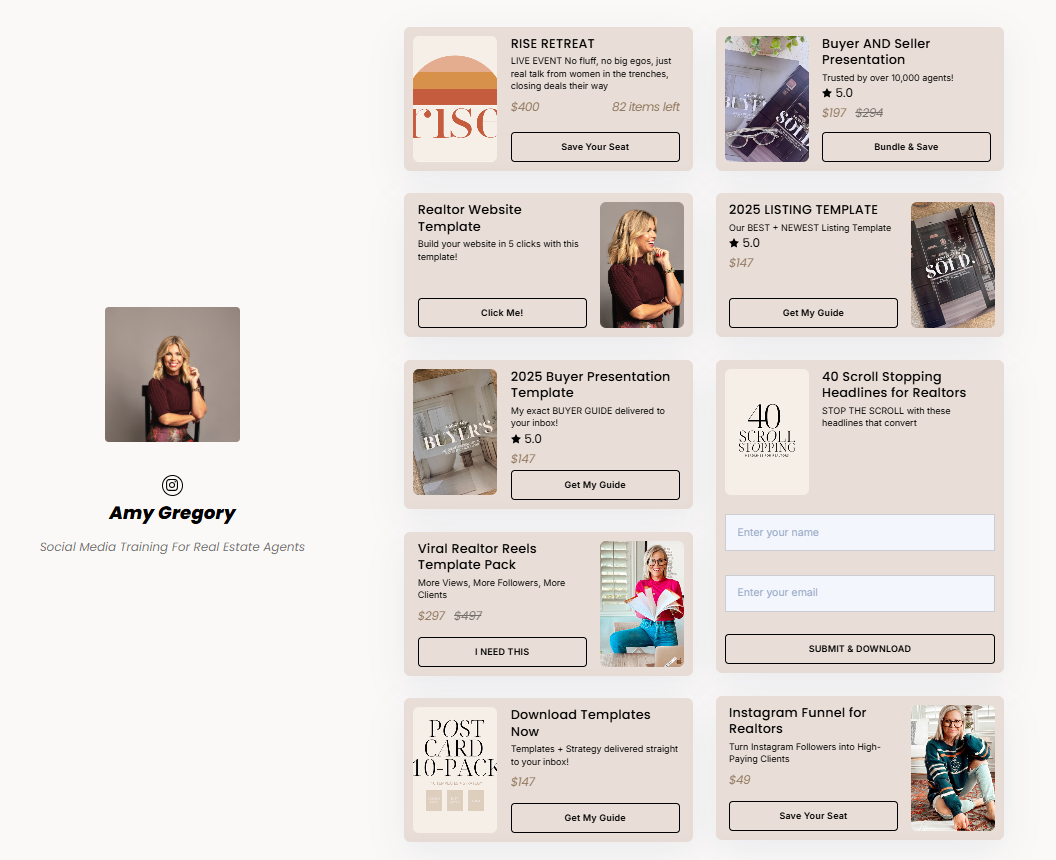
Example 1: The Social Media Doctor (Lauren)
- Bio Text: “Lauren is your ‘Canva & tech bestie’ who helps Creators, creatives and small business owners increase sales & followers through graphic design!”
- Story Behind It:
She was let go from her job in October, and didn't want another low paying role, so she doubled down on what she already knew. She started posting regularly, used Stan Store to launch her first course, and built multiple income streams (courses, membership, 1:1, digital products). - Why It Works:
- Relatable backstory: she mentions being let go, wanting to escape the 9-5, motherhood, etc. Helps people see “if she can do it, maybe I can too.”
- Clear promise: helps “increase sales & followers through graphic design.” It’s specific (graphic design), measurable (sales & followers).
- Multiple offers: not just one product; her variety gives different entry points.
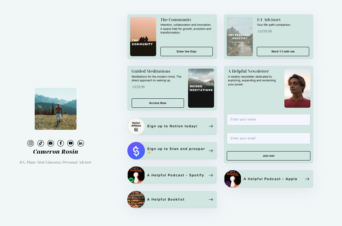
Stan Store Landing Page Examples
Landing pages (or product-pages) are where people decide to buy. Here are real examples and what you can learn from them.
Example: Lauren / The Social Media Doctor’s Course Pages
Lauren uses Stan Store to host several offers. Her landing pages often:
- Have clear product title + description of who it’s for. (E.g. “Canva College” is targeted at people wanting to improve design using Canva.).
- Include bonuses / extras: sometimes free coaching calls, or digital assets. These sweeten the deal.
- Show social proof or credibility: her backstory as someone who left job, built a store, multiple income streams. That builds trust.
- Use urgency/offers (sales, limited time, etc.). In one of her promotions she discounts the course, or includes a bonus 1:1 coaching for a limited time.
- Clean layout: few distractions, clear call-to-action button, breakdown of what you get.
Best Practices to Learn from These Examples
From these Stan store examples, here are some best practices you can adopt for your Stan Store page.
- Focus on a strong niche and clearly show who you serve and what you can help users do. Clarity helps people decide fast. If your store doesn’t tell them who you help, they’ll bounce. In your bio + landing page: explicitly say “for creatives / coaches / small business owners / etc.”
- Offer a variety of products (freebie / low-ticket / high-ticket). Not everyone wants or can buy the expensive stuff immediately; freebies/low priced items allow more people in and builds trust, also reduces friction. Offer a free download or low cost template; also have your higher value offer explained well.
- Have social proof + your personal story on your page. This helps build trust. When people see someone who has been where they are, they’ll more likely buy. Use testimonials, mention followers, write past successes, and a “how I got here” snippet.
- Optimize your page for urgency using bonus offers. Urgency is good for conversions because it pushes people to act fast. Use limited-time discounts, bonus content, payment plans, etc.
- Have a clean design that provides consistency & clarity. Clean, easy to read, and attractive design will help your brand build credibility. Use consistent fonts, colors; good thumbnails, images and avoid clutter.
- Make sure that your landing pages are focused on one offer at a time. If a page promotes many things, the message is lost and conversion might be poor. Single offer/lead magnet pages convert better. Use Stan’s landing pages for lead magnets or single product promos and hide them from the main store if necessary.
Great Store, But Are Your Students Actually Getting Results?
The best Stan Store examples all share one thing: a clear promise of transformation. Low-ticket entry, high-ticket courses, and a track record of students who succeed.
That last part is where most creators struggle, and where SchoolMaker makes the difference.
Stan Store gets people to buy. SchoolMaker makes sure they actually finish and get the results you promised. When students complete your course and succeed, they become your best social proof, leaving reviews, referring others, and fueling the exact trust-building loop that makes top Stan Store creators so effective.
More completions. More referrals. More sales, without needing a bigger audience.
Try SchoolMaker free and see how better learner outcomes drive more course sales.
Conclusion
The best Stan stores are usually the ones that are clear about who they serve, offer something low-entry (free or low cost), and lead people toward higher value offers by building trust.
Start with a solid bio + one good landing page. Make sure people know what you do, see the value, and can easily say yes. Once that works, you can layer in extras (bonuses, high ticket, membership, etc.)


