


Some people launch an online course and wonder why people aren’t buying even though their content is amazing, the problem most times isn’t the course, it is the landing page.
Your course landing page is where potential students decide if your course is worth their time and money. It’s the digital equivalent of your storefront. And just like a physical shop, if the window display doesn’t catch someone’s attention, they’ll keep walking.
So, how do you create a landing page that actually converts visitors into paying students? That’s exactly what we’ll cover in this guide.
You’ll learn:
- What a course landing page is (and what makes it different from a regular website)
- The key ingredients of a high-converting landing page
- Real-world course landing page examples you can learn from
- Proven tips to design your own page, even if you’re not a designer or marketer
What Is a Course Landing Page?
A course landing page is a standalone web page designed to sell your course. It is not a homepage, not a blog, and not your about page. Its single purpose is to convince visitors to take one specific action, enroll in your course.
Everything on that page, the headline, the copy, the visuals, even the buttons, should guide visitors toward that goal.
Think of it like a friendly sales conversation, not a brochure. Your page needs to:
- Grab attention.
- Build trust.
- Explain the value of your course.
- Remove doubts and objections.
- Make it easy to buy.
When done right, your landing page becomes your 24/7 salesperson, working for you even while you sleep.
Why You Need a Dedicated Landing Page for Your Course
Many first-time creators simply add their course to a general “Courses” section on their website. The problem? People get distracted.
A dedicated course landing page focuses on one thing, selling your course. No side links, no clutter, no distractions.
Here’s why that matters:
- Higher conversions: Fewer distractions mean more students click “Enroll.”
- Better messaging: You can tailor every line of copy to the specific audience and course.
- Easier testing: You can track performance and improve results over time.
If you want consistent course sales, a strong landing page isn’t optional, it is essential.
Anatomy of a High-Converting Course Landing Page
The best course landing pages share a similar structure. You can think of them as a story, guiding the visitor from curiosity to conviction.
Here’s a breakdown of the key sections (and what to include in each):
1. The Hook (Headline + Subheadline)
Your headline is the first thing visitors see. It should instantly tell them what your course does, and why they should care.
A good headline is:
- Clear: Avoid buzzwords.
- Outcome-driven: Focus on what students will achieve.
- Emotional: Tap into their goals or frustrations.
Examples:
- “Learn to Create a Profitable YouTube Channel , Even If You Have 0 Subscribers.”
- “Master Public Speaking in 30 Days , No Stage Experience Needed.”
Then add a subheadline that expands on your promise, e.g.:
“A step-by-step system to help you speak confidently, connect with your audience, and enjoy being on stage.”
Finally, place a CTA (Call-to-Action) button right under your headline, something simple like “Enroll Now” or “Watch the Free Lesson.”
2. The Problem
Once you’ve got their attention, describe the problem your audience is facing.
This is where you show empathy and understanding, you know what they’re struggling with, and you can help.
Example (for a writing course):
“You love writing but can’t seem to turn it into consistent income. You’ve tried pitching, blogging, freelancing, but it feels like you’re spinning your wheels.”
By describing their struggle in their own words, you make them feel seen.
3. The Hidden Cause (Why They’re Stuck)
Here’s where you dig deeper. What’s the real reason behind their struggle?
Maybe it’s lack of structure, no clear strategy, or trying to learn from scattered YouTube videos.
Example:
“Most aspiring writers don’t fail because they lack talent , they fail because they don’t have a repeatable system to find clients and deliver great work.”
This sets up your course as the logical solution.
4. The Solution (Your Course)
Now, introduce your course as the answer to their problem.
Example:
“Inside The Freelance Writing Blueprint, you’ll learn my step-by-step method for landing high-paying clients, managing projects like a pro, and building a sustainable writing career.”
Make it clear what’s included and what results they can expect.
Bullet points work great here:
- Learn how to find clients who actually pay well
- Build your portfolio (even if you’re a beginner)
- Set your rates confidently
- Automate your workflow and scale your business
This is where you show the transformation, not just the information.
5. The Results (Social Proof)
Next, show that your course works.
If you have testimonials or student success stories, this is where they belong.
Example:
“Before taking this course, I had no idea how to get clients. Within 3 months, I was making $1,200 a month from writing.” , Jane, course graduate
Don’t have testimonials yet? Use your own story or a realistic “imagine if…” example:
“Imagine opening your laptop each morning to new student enrollments, new clients, or new opportunities you once thought were out of reach.”
Stories make results feel real.
6. What’s Inside the Course
Now it’s time to open the curtain and show what’s inside.
List your modules or lessons with short, benefit-focused descriptions.
Example:
- Module 1: Find Your Niche – Discover the topics and audience that align with your skills.
- Module 2: Build Your Brand – Learn how to stand out and attract your ideal clients.
- Module 3: Land Paid Projects – Use proven strategies to pitch and get hired.
You can also add:
- Bonuses (e.g., templates, checklists, community access)
- Course duration
- Course format (videos, live calls, self-paced, etc.)
End this section with another CTA button.
7. About the Instructor (Credibility)
People buy from people they trust. Share who you are and why you’re qualified to teach this.
Example:
“I’m Sarah Miller, a full-time freelance writer who’s worked with 200+ clients over the past 7 years. I created this course to help others skip the trial-and-error and start earning faster.”
Include a photo and maybe a short video introduction if possible.
8. Satisfaction Guarantee
Even if your course is great, some visitors will hesitate because they’re afraid of wasting money.
A clear, generous refund policy removes that fear.
Example:
“Try the course for 30 days. If you don’t love it, I’ll refund every penny, no questions asked.”
That single sentence can double your conversions. If your content offers good value, you won’t get many refund requests.
9. The Cost of Inaction
Here’s where you remind them what’s at stake if they don’t take action.
Example:
“Every month you wait to start your writing career is another month you stay stuck in a job you don’t enjoy.”
This isn’t about scare tactics, it’s about helping them see the real cost of staying where they are.
10. FAQs and Final CTA
End with a list of common questions and objections:
- “Will this work for beginners?”
- “What if I don’t have much time?”
- “Can I get support if I get stuck?”
Answer each honestly and end with your final call-to-action, a clear, confident button that says:
“Join Now” or “Start Learning Today.”
Real Course Landing Page Examples to Learn From
Let’s look at a few successful course pages and what they do right.
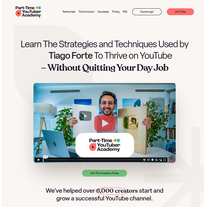
1. Part-Time YouTuber Academy (by Ali Abdaal)
What Works:
- Super-clear headline and outcome: “Learn The Strategies and Techniques Used by [Name of Popular YouTuber] To Thrive on YouTube.”
- Social proof: “We’ve helped over 6,000 creators start and grow a successful YouTube channel”
- Relatable tone, he uses his own story as proof.
- Great mix of text, visuals, and testimonials.
Takeaway: Be specific about results, and make your story part of your sales copy.
2. SEO for Solopreneurs (by Nat Eliason)

What Works:
- Minimalist design, no distractions.
- Clever tagline: “Minimum maintenance, maximum results.”
- Focuses on automation and lifestyle benefits, not just tactics.
Takeaway: Keep your copy tight, your visuals clean, and your promise memorable.
3. Build a Second Brain (by Tiago Forte)
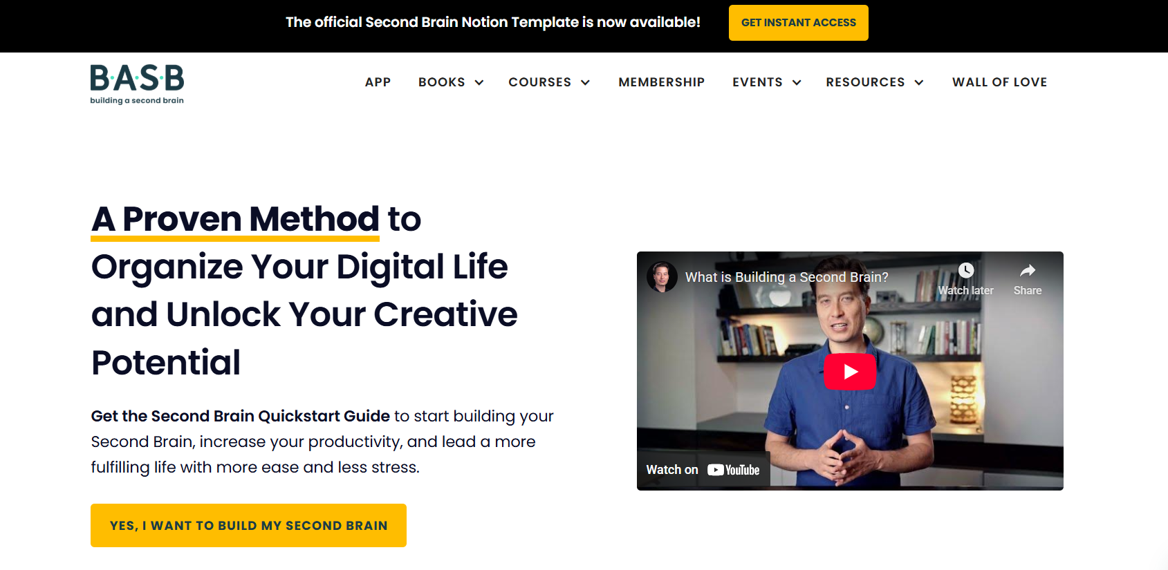
What Works:
- Clear promise: “Organize your digital life and unlock your creative potential.”
- Uses social proof (hundreds of testimonials).
- Explains both the method and the transformation.
Takeaway: Blend structure and emotion. Show how your course changes both mindset and results.
Tips for Creating a High-Converting Landing Page
You don’t need a professional designer or copywriter to make your page perform well.
Here are proven tips that anyone can use:
1. Focus on One Goal
Your landing page should have one main call-to-action, enrolling in your course. Don’t distract visitors with blog links, social buttons, or menus. Keep the focus crystal clear.
2. Write Like You Talk
Avoid jargon. Write like you’re explaining your course to a friend. Use short sentences, natural tone, and contractions (“you’ll,” “it’s,” “don’t”).People buy from people, not robots.
3. Use Visuals Strategically
Add high-quality images, short demo videos, or screenshots of your course platform. But keep them relevant. Every visual should serve a purpose, to clarify, inspire, or build trust.
4. Add Social Proof
Even one testimonial or review can build massive credibility. If you don’t have students yet, share your own results or create a “beta group” to collect early feedback.
5. Optimize for Mobile
Over 60% of visitors will view your landing page on a phone. Make sure your layout, buttons, and forms look great on smaller screens.
6. Keep It Simple
Don’t overwhelm visitors with walls of text. Use clear headings, white space, and bullet points. Remember: clarity sells, confusion doesn’t.
7. Test and Improve
Even the best landing pages can perform better. Try A/B testing different headlines, colors, or CTA buttons. Track conversion rates using tools like Google Analytics or Hotjar. Small tweaks often lead to big improvements.
Bonus: Tools to Build Your Course Landing Page
You don’t need to code anything from scratch, these platforms make it easy to create beautiful, high-converting pages in minutes:
- SchoolMaker: Built for course creators with drag-and-drop blocks.
- Kajabi: Great all-in-one platform with landing page templates.
- Podia: Simple and affordable for beginners.
- ConvertKit: Ideal if you’re combining email marketing with course sales.
- Carrd or Webflow; Great for one-page minimalist designs.
Pick one, choose a template, and focus on your copy, not your code.
Conclusion
A great course landing page isn’t just about looking pretty, it’s about communicating value clearly and confidently. Remember, you don’t need fancy graphics or marketing tricks. You just need:
- A clear promise
- A logical story
- Genuine proof
- A simple, confident call to action
When you build your page with your students’ journey in mind, you’ll turn curiosity into trust, and trust into enrollments. Start small. Launch, learn, improve, and soon, your landing page will become one of the most valuable assets in your online course business.


